Archives for the month of: November, 2009

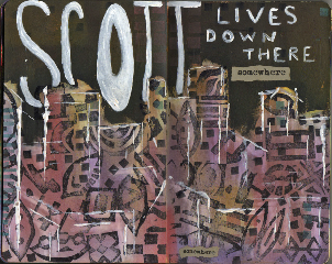
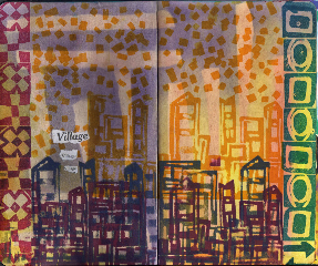
More journal spreads:  “Village” started with putting some torn drafting tape on the pages and then wiping on some Pan Pastels.  After removing the tape I used some eraser stamps on the borders.  The buildings and confetti are fun foam stamps.

Village


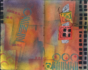
At the same time I was working on “Village” I also made a Pan Pastel background on another spread.  Might as well since they were out and my fingers were messy.  
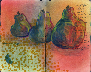
On top of a list and some bleed through ink from the self portrait spread, I sketched a still life of pears that I had in iPhoto and then used Caran d’Ache watersoluble crayons using water .  More confetti was stamped.

Three_pears_spread


“Many More Pears” started with stamping the spread with both positive and negative fun foam shapes and confetti.  The big pear was drawn in pencil and then colored with Crayola washable markers.  I spread Pan Pastels over everything and rubbed it in good.  Then I went over the pear with the Caran d’Ache crayons and blended with water.  I traced the four yellow pears from a couple of stamps and painted them with gauche and then with the crayons.

Many_more_pears_spread


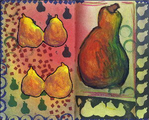
I outlined the big pear with black crayon and blended a bit.  The yellow pears are outlined with a Pitt brush pen and then stamped around the left page with blue ink.

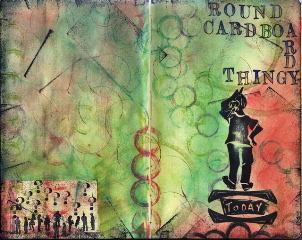
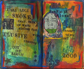
The inside front and back covers  of the journal started out as practice areas for stamps and paints and markers, etc. so I thought I would just tidy them up a bit and finish them off.  Just a hodge-podge collection of paint and stamps, sheer heaven transfer and collage.

Inside_front


Inside_back


I was asked how I put images in between text on Posterous.  I compose an e-mail using MobileMe.  I type in some text, attach a photo which shows up in the body of the e-mail, make sure the cursor is placed beyond the picture and type some more, add another pic , etc.  I can’t do this using my Yahoo Mail account.  The times I tried I just got one big picture with the little ones on top of it that have to be clicked on in order to view.   I don’t like this – it is very annoying. 

I finished completely the self portrait atc’s (all I have to do is address the envelope and slap on the stamp).  I used – wait for it – fun foam!  Designed it first in PSE – or rather, I picked out a pic of me from iPhoto and then did a line tracing of it, sized it to 2.5 x 3.5 and printed out the drawing, traced it w/pencil on tracing paper and just rubbed it onto the fun foam.   Next the scissors and it worked like a charm.  I printed an old journal page of mine onto some heavy printmaking paper  (printed two sheets) I got eons ago in Woodstock (thanks Kate!), cut it down to 3 strips with room for four atc’s on each, put some color on this background with the Pan Pastels (very quick way to add color) and stamped away.  I messed up one but later on I printed the drawing on some of that cheapo green paper and collaged the face over the mess.  I designed labels for the back and for the first time put the reclinerart url on it with my e-mail address.  

While I was doing all this I also stamped on a journal spread and ended up also collaging some of that green paper.    

I’m having so much fun with this journal business that the kitchen is probably messier than it ever was.  I don’t mean dishes in the sink messiness – nope – I ALWAYS wash my dishes and throw out the garbage and pick up anything I drop .  I’m taking about art stuff – paints, pencils, stamp pads, homemade stamps, paper scraps – everything – what  mess.  But, I’m having fun and I’m happy.

Here are the atc’s that I’m keeping:

Self_portrait_atc


Here is a temporary collage using the  atc’s that I’m keeping.  I positioned them on the piece of good paper that I keep below my work and which catches the drips and drabs and on which I check that stamps work and on which excess Pan Pastels collect.  I just scanned this so I would have something digital to play with:

Self_portrait_temp_coll


And here is the journal spread.  The jury is out on this still but I tend to like it as it is and am trying not to overwork it.  Basically I like it but perhaps I will go back to it at a future time.

Journal_spread_self_portrait

Yesterday I went on a mad shopping spree. I stopped in at Michael’s, Pearl, Office Max, Utrecht and AC Moore. Spent a lot on loads of little things. One thing I bought was a set of Holbein tube gauche paints. Don’t bother to ask why – I wouldn’t be able to answer that question. I squeezed a dollop of each into little wells on two tiny plastic pallets and painted sorry excuses for swatches of each color in my journal. I suppose I don’t have to mention that prior to this I had used some of my eraser stamps and also stamped using a piece of corrugated cardboard. In an effort to “unite” everything I took some pan pastels and rubbed them over the whole spread, buffed and erased parts that overlay the swatches so that maybe the true color would show. Maybe. Anyway, did a bit of journaling on the spread and then covered up most of it with some collage items. Whether it’s any good or not is of no matter to me. It left me feeling good.

Guache

And, I have been informed that the pan pastels will not work on gesso – hence the reason why they rubbed off on the previous image – although they did work on the rougher white gesso.

Also, today, I received the complementary copy of Winter 2010 Art Quilting Studio today and two of my pieces are in the gallery section.  The photography was wonderful.  I also was reminded – by my own article – of the technique I used on “Take the F Train to 14th Street” and that made me realize that is probably the solution for one of the projects that was stalled. Duh. and  Yay.  Now as soon as I get the oomph I’ll work on it.


I painted the bottom two thirds of the spread with white gesso which was kind of thick and streaky, and the top third with fluid black gesso (I’m a big fan of gesso). I stamped on the white with carved eraser stamps & Stazon ink. Then I rubbed the pan pastels on the black gesso but was disappointed – the colors did not show up unless they were in the dusty-pre buffed stage. As soon as I buffed them they pretty much came off. I did find that if I used a mask and buffed I could differentiate some faint color on the black. On the white gesso I noticed a difference as soon as I applied the pastels – the surface was very rough and there was no problem. The stamping showed through nicely. But, boy was it ugly. I used the edge of a credit card and the white gesso to make edges, erased a bit and finally wrote the text with the white gesso and then collaged a word. Not my best but it says what it’s supposed to.

Scott_lives

I finally tried the Pan Pastels and what has been said about them is 100% correct. They are less dusty, easy to apply (I used a small square of scrap batting – one for each color) and once you “burnish” them with a paper towel (or in my case, a piece of gauze), they do not come off the page. Not one bit. I’ve been compulsively rubbing the surface with my hand because I am flabbergasted. I stamped on top of them and glued the collage on with a Uhu glue stick. I also used some colored pencils here and there to help differentiate the shape edges. They are also erasable but I didn’t try that on this piece. This was purely experimental and it ended up this way all by itself – I had no plan at all. I think my brain gets aerated after I come back from my walk and this is what happens.

Chelsea

Last evening
I came back from my walk – (took some pics as the sun went down while listening to Joan Armatrading on the iPod).
Washed my breakfast & lunch dishes and started to get things ready for cooking (cooking – ha ha ha) dinner and found myself going off on a tangent.

Journal_spread_24


Well, it only lasted one day. I found, as the day/evening went on, that the thought of setting up this goal for myself was adding a niggling bit of stress. Since I had decided mucho mucho years ago to eliminate any unnecessary stress that I can get control over, I slapped my face twice and decided that I was only going to do this EDM thingy when the itch needed scratching and I was NOT going to do it in order (so there! OCD).
Phew. Feel much better already. Then I was reading a new blog and saw that the artist would, (1) work in any old order and (2) combine multiple items in one drawing. Ha! Anarchy. Phooey on make believe rules. I’m gonna do whatever I want! (at least in this matter).

And, just ’cause I can – here is a picture from Jones Beach a few years ago.

Img_3092

Ok, I just discovered the LIST. I think I’m going to try doing one each day. Of course, this resolve, like all others, is flexible. Some days I’ll be careful and some days I won’t. Everyday it will be fun.

Edm001


I bet that anyone who knows me would be surprised that I have a shoe like this in my house. It’s probably 30 years old and never been worn – it was sooooo uncomfortable – what was I thinking. I pulled it out of the “going to Goodwill” box.

with pen and acrylic paint. It’s so easy to go off on a tangent but, since it was using paint it was perfectly permissible.

Spread-23

except no paper or cardboard allowed. These are the finished atc’s that I referred to in the yesterday’s post. The labels on the backs are printed on cotton and glued on. Of course I finished them instead of writing the article which I was supposed to do yesterday. Tomorrow it will be done. I’m taking me and the computer out of the house because it seems that I’m distracted by the paints and fabric and sewing machine.

Non-paper-atcs